The case for the crop
Why every watch in this catalogue is photographed against nothing at all.
The Dials desk · 2 min read
Product photography is a negotiation between the watch and its background. Studio shots from a dozen sources arrive with a dozen different greys behind them, and lined up in a grid the effect is a patchwork — your eye reads the backgrounds before it reads the watches.
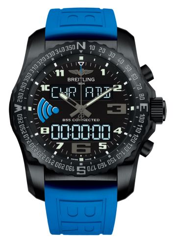
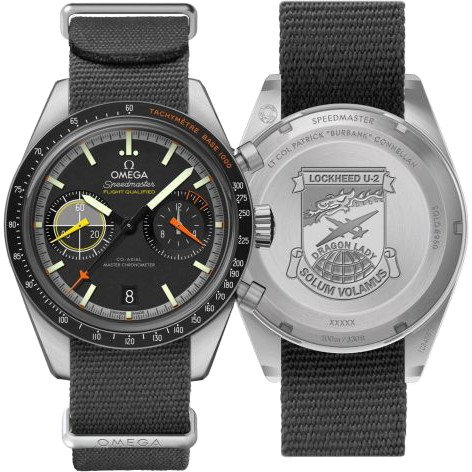
So we remove them. Every image in the catalogue is cut out and squared off, which means a Speedmaster and a Datejust sit on the same ground and can actually be compared.
What it costs
It is slower than it sounds, and it fails in interesting ways:
- Polished bracelets reflect their surroundings, and a mirror-finished link can take part of the old background with it.
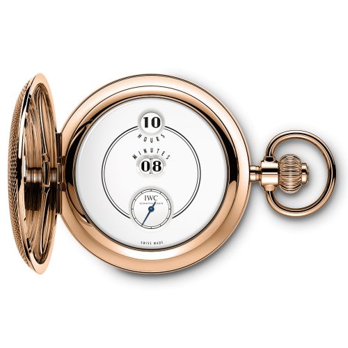
- White dials against a white sweep have no edge to find.
- Anything transparent — a sapphire case back, a skeleton dial — has no single right answer.
A cut-out is a claim about where the watch ends. Most of the time that is obvious. The interesting failures are the times it is not.
What we keep
The original stays. A crop is stored alongside the picture it came from, never in place of it, so a bad cut-out is always one column away from being redone — and a reviewer can see both when deciding which image leads.